ApkPy 1.5.0 — The same words on both sides
Version 1.5.0 is two things that turned out to be one: the fingerprint check, and the two renderers agreeing about the words they share.
They belong together because the biometric prompt is the sharpest case of the same problem. Android draws that dialog itself, so the only thing the two runtimes can agree on is the words and the result — which meant giving its seven possible outcomes one shared table, exactly as the type ramp and the surface planes do for sizes and colours.
Every change below is one of two things. It either gives a name to something that never had one — a step on a type ramp, a plane between the background and the surface — or it repairs a place where the Previewer and the Android generator had quietly chosen different numbers for the same idea.
Those turn out to be the same thing. A value with no shared name is a value each side is free to guess at, and both sides guessed reasonably. That is precisely why nobody noticed.
What changed
The fingerprint check
biometrics.unlock(title=, subtitle=, cancel_text=, allow_pin=, on_result=);- seven result words, shared by both runtimes, never empty;
fingerprint,lockandlock_openin the icon catalogue.
A vocabulary for size
--text-xs…--text-3xl— seven steps, 11 / 12 / 14 / 16 / 20 / 24 / 32 at the default theme, scaling withTheme(font_size=);--leading-tight,--leading-normal,--leading-loose.
A vocabulary for depth
--surface-low,--surface-high,--border-subtle— derived from the colours the app declared, not from Material's palette;- all three are written as resource references, so
values-night/answers them andappearance.set()moves them.
Two renderers that disagreed
label("...")with no stylesheet was 14px on the desktop and 16sp on the phone;- the active tab's label in the bottom bar was bold in the Previewer and normal on the phone.
Guard rails
U2031— a token used in a slot of the wrong kind;U2029— a stylesheet property no renderer reads;- the full stylesheet vocabulary is now a table in the docs, generated from the same set both renderers read. 87 properties.
Also fixed
box-shadowon acontainer, and the clipping that cut shadows off;paddingwith three or four values, and the four longhands.
The ramp
Seven steps, as multiples of Theme(font_size=14):
| Token | Default | Typical use |
|---|---|---|
--text-xs |
11px | overline, timestamps, a tab label |
--text-sm |
12px | captions, helper text under a field |
--text-base |
14px | dense list rows |
--text-lg |
16px | body text — what label() uses when asked nothing |
--text-xl |
20px | a section heading |
--text-2xl |
24px | a screen title |
--text-3xl |
32px | a number you want read across the room |
title    { font-size: var(--text-2xl); line-height: var(--leading-tight); }
body     { font-size: var(--text-lg);  line-height: var(--leading-normal); }
caption  { font-size: var(--text-sm);  color: var(--text-secondary); }
The steps are Material's own sp values, not a geometric series. One ratio lands on 29.3 where the platform says 32, and each renderer rounds it differently — which is exactly the kind of small, invisible disagreement this release exists to remove.
Theme(font_size=18) moves all seven together, so an app made for older eyes
stays proportional instead of needing 17 edits.
Measured before it was built
Across the 25 shipped examples there were 17 distinct font sizes, with 13px, 14px and 15px accounting for 32 uses between them — the same intent written three ways, in three files, by the same person on three different days.
The three planes
A card has to sit on a surface. A well has to sit under one. A divider should separate without shouting. None of the three had a name.
sheet    { background-color: var(--surface-high); }
well     { background-color: var(--surface-low); }
group    { divider-color: var(--border-subtle); divider-width: 1px; }
When the app declares its own surface, background or border, the three
planes are derived from those colours rather than falling back to
Material's palette. This is not a detail: a warm theme that borrowed a cold
grey plane would grow a slab of somebody else's design in the middle of it.
| Token | How it is derived |
|---|---|
--surface-high |
the surface, 6% toward the text |
--surface-low |
55% of the way from the surface to the background |
--border-subtle |
35% from the surface toward the border |
That last number is not invented. Material places outlineVariant at roughly
35% of the way from surface to outline in both light and dark, and an
earlier draft that pulled the divider toward the background produced three
levels of contrast — which is not a faint line, it is no line at all.
A subtle divider is not always the better one
If a theme's border is already close to its surface, it is already
playing the quiet role and there is no room underneath it. The bundled
writehere.py is one such theme: --border-subtle made its rows float,
so the example still uses --border. Render it and look before you swap.
Body text was two different sizes
label("Hello"), with no stylesheet at all, drew at 14px in the Previewer
and 16sp on Android.
Two literals, written into two files at different times, each perfectly defensible on its own. The reason it survived so long is that "body text" never had a shared name for the two sides to disagree about — there was nothing to compare, so nothing looked wrong.
It is the most used component in the library, so the gap was in every app ever built with it.
Both sides now read the same step of the ramp (--text-lg). The phone's
number wins, so no compiled app changes as a result.
The active tab was wearing three badges
Material's Widget.MaterialComponents.BottomNavigationView points
itemTextAppearanceActive and itemTextAppearanceInactive at the same
textAppearanceCaption — 12sp, weight normal. On the device the active tab's
label differs from the others only in tint; the state itself is carried by
the pill behind the icon and by the icon filling in.
The Previewer was bolding it as well — a third signal the phone does not have — and asking Tk for ten points, which is 13.3px at 96dpi where the phone renders 12sp.
Both are fixed. This one is Previewer-only: the generated XML is unchanged.
Icons without an outlined variant are correct
Five common navigation names — search, list, chart, inbox,
checklist — ship no outlined variant, and that is not an omission.
Measured as ink coverage, the 13 outlined variants in the catalogue sit
between 0.161 and 0.356; those five sit between 0.139 and 0.167, at or
below the lightest outline there is. They are outlines already, and
Material has a single glyph for them too. Their tab still fills, tints and
shows the pill.
A token in the wrong kind of slot
--text is a colour. --text-lg is a size. Three characters apart.
A size in a colour slot dies in parseColor the moment the screen opens,
which at least tells you something. A colour in a size slot is worse:
#211F26 quietly becomes 21px and the app simply looks wrong.
A composite value such as 0 3px 8px var(--border) is left alone.
Effect on existing apps
An app that mentions neither the new tokens nor biometrics generates the
same XML it generated in 1.4.0, with two deliberate exceptions carried over from the
shadow and padding repairs:
- an app that uses
cardnow gets thebox-shadowits theme has always declared, which was being clipped away; paddingwith three or four values now applies the value it names on the phone, instead of dropping the bottom.
The body-text repair resolves to 16, which is the number Android was already using. The bottom-bar repair touches the Previewer only.
Verification
| Suite | Count | At 1.4.0 |
|---|---|---|
Transpiler harness (playground/transpile_tests.py) |
256 | 256 |
Feature tests (tests/features) |
515 | 380 |
Core tests (tests) |
35 | 21 |
All 25 examples in examples/ transpile. The new tokens appear in no
layout and no drawable of any of them -- only in the two colour tables,
which is what an opt-in token is supposed to do.
res/values/apkpy_theme.xml and res/values-night/apkpy_theme.xml each carry
apkpy_surface_low, apkpy_surface_high and apkpy_border_subtle, with
different values per table.
Theme(font_size=18) moves the whole ramp together: a heading that was 20sp
becomes 26sp, body text 21sp, a display number 41sp.
The bottom bar was rendered and inspected in both modes, on all three tabs, before and after -- because a test can confirm that a label is not bold, and cannot confirm that the bar looks right.
The fingerprint check
def unlocked(ok, reason):
    if ok:
        on_click_navigate(vault)
    else:
        toast(reason)

biometrics.unlock(title="Unlock the vault", subtitle="Use your fingerprint",
                  cancel_text="Use password", on_result=unlocked)
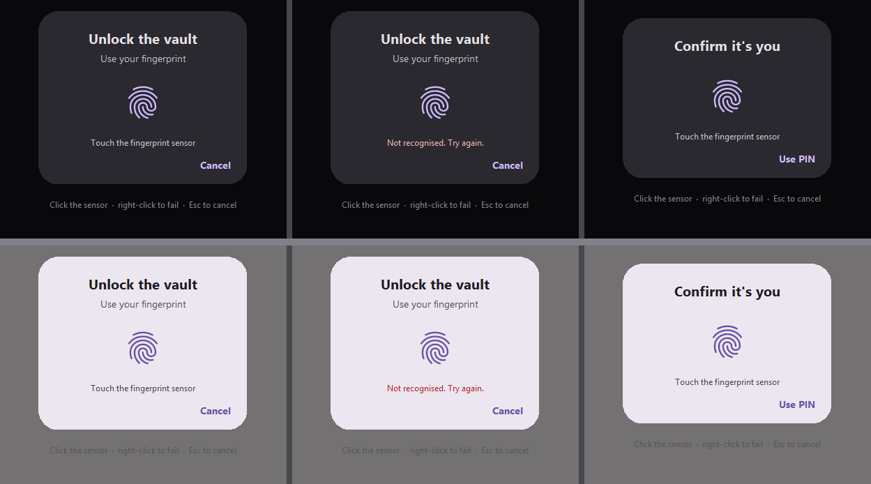
Android draws this dialog itself. BiometricPrompt is a system surface: an
app supplies the title, the subtitle and the words on the cancel button, and
the platform draws the rest — shape, colours, sensor, typeface. That is why
those three strings are the whole API. A typeface declared with font() does
not apply here, on either runtime, because it does not apply on the phone.
on_result receives (success, reason). reason is "ok", or one of
cancelled, no_hardware, not_enrolled, unavailable, lockout,
failed — never an empty string, so an app always has something to say.
Both runtimes resolve those words from one table, and the generated Java's
switch is emitted from that table, so the two cannot drift.
The status is checked before the dialog is built, so a phone with no sensor
gets no_hardware rather than a prompt that cannot succeed.
allow_pin=True adds the device PIN, pattern or password. The cancel button
disappears in that mode — not a simplification: Android's PromptInfo.Builder
throws if a negative button and DEVICE_CREDENTIAL are both set.
A scan that simply does not match is not a result. Android keeps the prompt open and lets the person try again, so the callback does not fire — and the Previewer does the same.
The desktop has no sensor, so the Previewer draws a replica from the same three
strings: click the fingerprint to scan, right-click it for a bad scan, Esc to
cancel. The hint sits on the scrim, outside the card, so the card stays a copy
of what the phone shows.
New in the icon catalogue: fingerprint, lock, lock_open (aliases
biometrics, touch_id, unlock). 68 names.
Reference
- Themes and styling -- the tokens, the ramp, the planes
- Friendly errors --
U2029andU2031 - Previewer versus Android -- what the two runtimes share
- Components and layouts --
bottom_navand the rest
Upgrading
Nothing in 1.5.0 requires a change to an existing app. The tokens are opt-in, and an app that names none of them generates the project it generated on 1.4.0.
Three behaviours changed without an opt-in, all three because they were defects:
- An app that uses
cardnow gets thebox-shadowits theme has always declared. It was being clipped away by the parent's padding box, so cards will look slightly different -- they now look the way they always asked to. paddingwith three or four values now applies what it names on the phone.padding: 0 20 24 20was reaching Android as0 20 0 20, so a layout that was silently missing its bottom padding will gain it.- The bottom bar's active label is no longer bold in the Previewer. If you were reading that boldness as the state signal, the pill and the filled icon carry it -- and always did on the phone.